« Microsoft Project 2007 Released | Main | Coral Bark Maple - Sango Kaku »

Gapminder Visualization from Google

Just ran into this visualization tool which shows animated statistics for a number of key categories (child mortality, CO2 emissions, fertility rate, economic growth, urban population and a bunch of others) broken down by country over time.
Gapminder.jpg
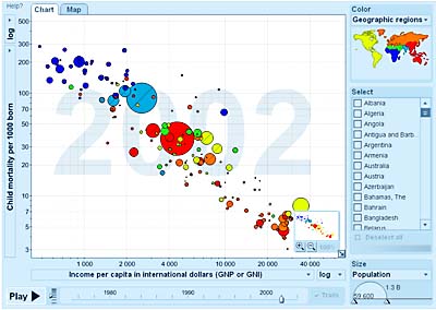
Fun to play with and it does show some encouraging trends. Child mortality has been decreasing steadily in most parts of the world. Africa shows a few exceptions.

Worth taking a look at here

RELATED POSTS
  • Search Frustration? Maybe you are doing it wrong
  • Luck is where you find it - How to skip directly to Great without passing Go
  • Visualization
  • Well if it is not Google in bed with the terrorists, then it is those damn artists in bed with the CIA
  • "People come to us in weakness"

  • Comments (1)

    totally totally cool, that tools.google thing. i want the job of the person who sits around making that kind of cool sh@t. totally totally awesome.

    i'm still waiting however for a tool that proves the 6 degrees of separation thing 'on the fly' and 'live' on the web, kinda like that one...

    enjoying your site.
    writing myPMP on monday feb.12.
    wish me luck

    Post a comment

    (Comments are moderated to fight SPAM and will be published after I have a chance to approve them. Thanks for waiting.)

    About

    The previous article is Microsoft Project 2007 Released.

    The next article is Coral Bark Maple - Sango Kaku.

    Current articles are in the main index page and you can find a complete list of articles in the archives.

    Creative Commons License
    This weblog is licensed under a Creative Commons License.
    Powered by
    Movable Type 3.34